My redesign
After just furnishing my new home with everything IKEA, I had spent many, many hours on the IKEA website. While their home page has been modernized, the product pages themselves feel a little outdated.
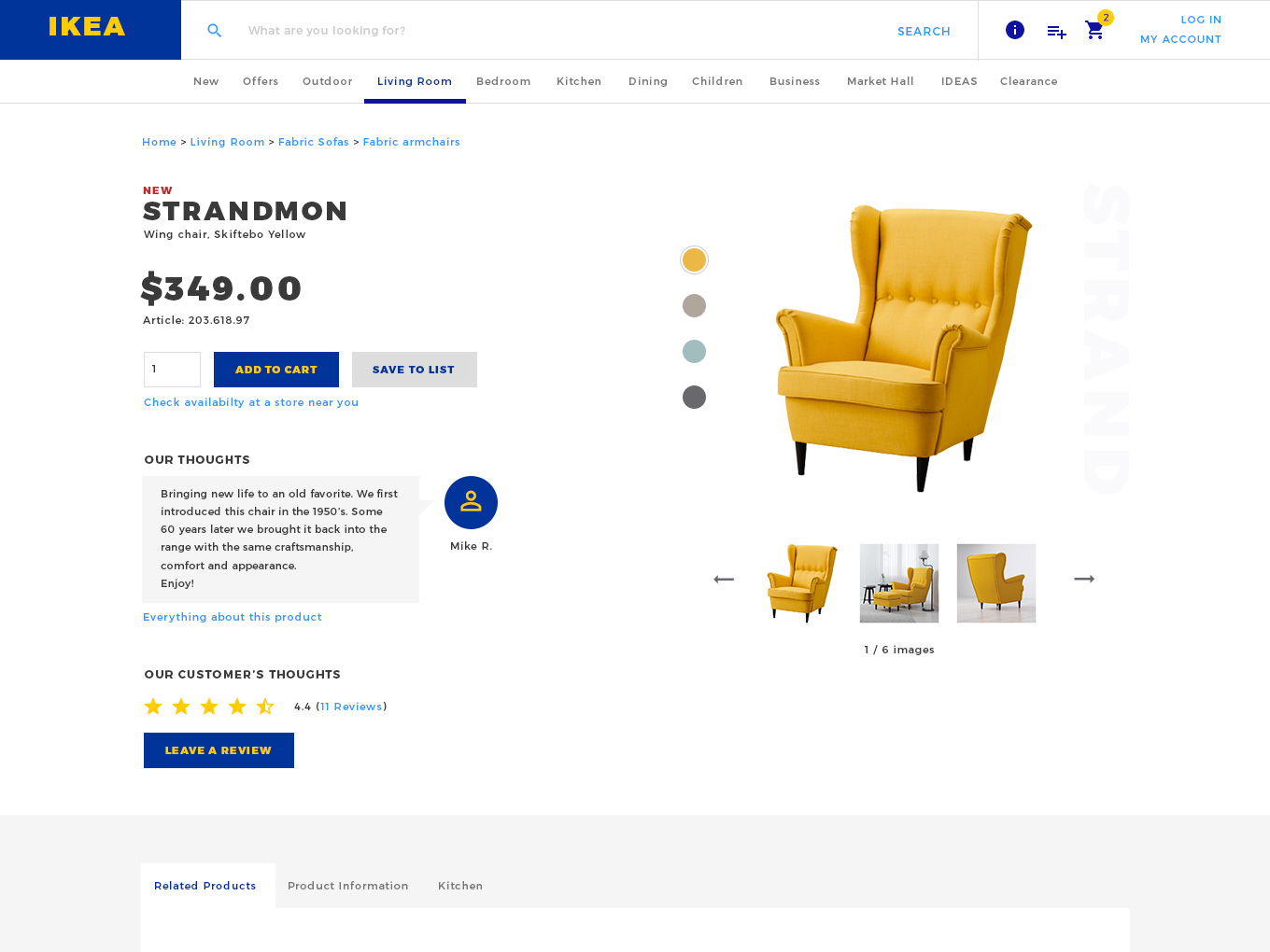
This morning I decided to redesign one of the product pages my wife and I visited frequently. Check out the original page (desktop view).
As you can see I tried to remove all the cutter from the header and give everything a little bit more breathing room.
Most of the links in the header could be placed in a modal, which is activated by the info icon. Instead of all bombarding the user with a whole bunch of links, this header focuses on why the user is here; to find products.
Much like the header, the focus for me was to eliminate clutter. THis was done by grouping items into smaller sections, and giving each section enough space to breathe.
I move the information about the product to the left, since I felt it flowed better. When a user loads a page, their eye is first drawn to the left side of the screen. Because of this, the user is shown immediately what they are looking at, the price, and the ability to add it right away.
To declutter the image section, I placed a control on the left to change the colour, and chose to only show 3 thumbnails at a time. This allows the thumbnails to take up more room, and helps the user decide if they want to see more of that image.
Throughout the page, I tweaked the wording, and added in more human elements (Such as a chat bubble and the name of the designer) to help make the experience seem more friendly and personal to the user viewing the page.
I found this exercise to be quite refreshing and an enjoyable experience. Not only did it stretch my creativity / UI analysis, but it also gave me the change to design something without any boundaries. Often times we don't get to do that in our industry (due to time constraints, device / browser support, or client feedback. It was nice to take a moment and do something for the fun of it.
I encourage you to find a product on a site (doesn't have to be IKEA), pick a platform (I chose desktop) and try to redesign the user experience / design of the page!
Happy designing!
I would love to hear from you!
Whether it's to chat, ask me about a project, pick my brain, ask me about an opportunity, or you're simply a little lonely, you can reach me / follow me on any of the below options. You can also leave a message with my contact assistant and I'll get back to you shortly!
 Dribbble
 Github
 LinkedIn
 Stack Overflow
 Instagram